The left is always droning on and on about alleged “income inequity”. That – plus the claim that those “evil conservative economic policies” are changing the US to become a society with a tiny minority of very rich and a host of extremely poor, with a disappearing middle class – seems to be among their “five pillars of faith”.
In fact, one of our frequent commenters with a decidedly Leftist bent has even posted slides from that “Great Center of Economic Wisdom and Analysis” Mother Jones purporting to “prove” that is the case.
I’m not going to debunk those “wonderful” Mother Jones slides individually; they’re simply not worth the time. Suffice it to say that they are misleading. My guess is that they were constructed using means (averages) vice median values for data. As I noted in the previous article in this series, using mean values allows the data to be skewed greatly by a small number of huge “outliers”. That’s particularly true when you’re talking distribution of wealth or income, where a few people with a huge income or net worth (think Bill Gates) can grossly inflate the overall average (mean) and obscure the reality of the situation.
Well, longtime readers probably can see what’s coming. I got curious, so I decided to look for some definitive numbers. And, “Lo and behold!” – I found them.
It was easy, actually. They were in the same place I found some of the numbers for the previous article in this series.
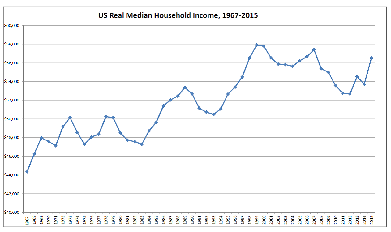
You see, it seems the US Census Bureau also collects data on US household income each year. They also publish that data, adjusted for inflation using CPI-U-RS, annually – going back to 1967. Further, the published data is conveniently “binned” into nine different household income categories, ranging from poverty (<$15,000 annual household income in real terms) to quite well off (>$200,000 annual real household income).
So, yeah – I decided to look at that data and see if it agreed with the Left’s claims. I mean, really – the data’s all there. All you have to do is download it and analyze it for yourself.
The results were interesting. But first, a small sidebar.
Just What Is the US “Middle Class”?
Perhaps not surprisingly, there are actually multiple definitions for the US “middle class”. The one we’re concerned with here is a definition based on household income – and such a definition indeed exists. Pew Research – who usually has their organic fertilizer well consolidated and neatly stowed when it comes to economic research and analysis – defines the middle class as having a household income ranging from “two-thirds to two times the national median income for your household size”. For 2014, that equated to a household income between $46,960 and $140,900.
Frankly, IMO there are some problems with that definition other than the fact that it appears kinda arbitrary. First: that definition excludes the bulk of a number of occupations that have traditionally been considered “upper middle class” – doctors, dentists, and nurse-anesthetists being examples. All three of those professional occupations (and possibly some others) have median incomes above the upper end of that range. So I’m going to modify the definition for middle class I use here a bit.
The second problem is more practical: the income breakout by categories provided by the Census Bureau data doesn’t line up with those Pew Research income limits for the Middle Class. So as a first cut, for income classes I’m going to use the following definitions:
- Low Income: <$35,000 annual real household income
- Middle Class: $35,000 to $150,000 annual real household income
- “Wealthy”: >$150,000 annual real household income
Yes, the quotes around the class “Wealthy” are intentional. With a lower limit of $150,000, this “Wealthy” category IMO includes a large portion of some occupations traditionally considered “upper middle class”.
My definition here – like Pew Research’s – is a bit arbitrary. Here’s my rationale for the above categories. First, I want to capture at more of those traditional “upper middle class” occupations that would be excluded using Pew Research’s upper limit. Second, I have no way of knowing the distribution within the Census Bureau’s $35k-$50k or $100k-$150k income “bins” – so I’m not going to attempt to split them. And, finally, $50k real household income hardly seems to qualify as “low income” anyway.
I’ll revisit these definitions later in the article. But they’re as good a starting point as is practical, given the data to which I have access.
The Data.
The data, as noted above, was obtained from the US Census Bureau. The specific source is noted at the end of the article.
The data shows the percentage of US households having real incomes in each of 9 categories for the period 1967-2015. As was the case with the previous article in this series, the data has been adjusted for inflation, with 2015 as the base year, using the Bureau of Labor Statistics’ CPI-U-RS from 1977 on and the Census Bureau’s derived CPI-U-RS for the period 1967-1976. For completeness, here’s a graph showing all 9 income categories. Don’t worry if you can’t make heads or tails out of it – it’s far too busy to interpret easily. I’m providing this chart for illustrative purposes and completeness only.
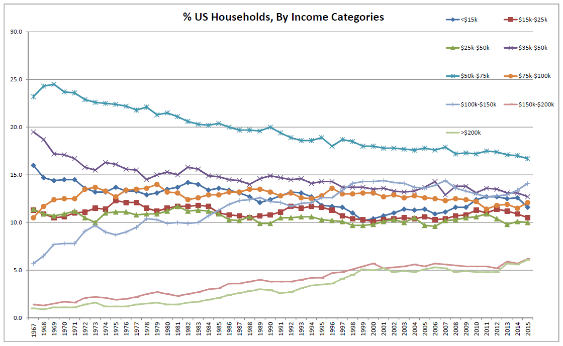
A larger version of the same image
may be viewed here.
First-Cut Analysis
OK, after “binning” the data into the three classes defined above, I prepared a second chart. This chart is simpler – it shows the percentage of US households that, according to real annual household income, fit into each of those three class “bins” (Low Income, Middle Class, and “Wealthy”). I’ve added trend lines to each of these data series to visually indicate the trend of change over time.
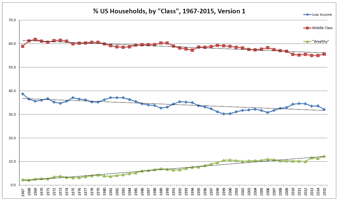
A larger version of the same image
may be viewed here.
Hmm. In 1967, 58.9% of US households were “middle class”. And in 2015, the fraction of US households that were middle class was slightly smaller – but only slightly. In 2015, the middle class comprised 55.6% of US households. That is 3.3% less than in 1967.
Looking at that, I’ll be damned if I can see a “disappearing” middle class. Yeah, proportionally it’s slightly smaller. But it’s not a helluva lot smaller. And that’s over a period spanning nearly 50 freaking years. At that rate, it will take something like another 800 years or so for the US middle class to vanish. Doesn’t seem to be exactly the “major crisis” the Left keeps yapping about.
So, where did those 3.3% of US households go? If the Left is right, those “evil Reagan tax cuts” drove them to the Low Income category. Is the Left correct?
In a word: no. Or as we might have put it where I grew up: “Oh HELL no!”
In 1967, in terms of real household income 38.7% of US households were “Low Income” – e.g., real household incomes of $35,000 or less. But in 2015, only 32.1% of US households were in that same Low Income category in real terms. That’s 6.6% fewer US households than in 1967.
Don’t forget, the middle class shrank half that much between 1967 and 2015 also. That means almost 10% fewer US households today are Low Income and Middle Class today than in 1967.
So, what the hell? Where did nearly 10% of US households go?
The answer is simple. They became “Wealthy”.
In 1967, the fraction of US households with a real income of >$150,000 (and which thus were “Wealthy”) was indeed tiny. In 1967, only 2.4% of US households – or roughly 1 household out of 42 – had a real household income of $150,000 or more.
Today? Well, the percentage of US households that “Wealthy” by that criteria is 12.3% – or roughly 1 US household in 8. THAT is where the “missing” poor and middle class went. They freaking got wealthy.
Second Pass: Reworking the Categories.
OK, maybe those categories were “bad”. So let’s try a more detailed look. Let’s “re-bin” everyone, using the following categories. Maybe that will help us see what’s happening.
- Poverty: <$15,000 annual real household income
- Working Poor: $15,000 to $35,000 annual real household income
- Lower Middle Class: $35,000 to $50,000 annual real household income
- Middle Class: $50,000 to $100,000 annual real household income
- Upper Middle Class: $100,000 to $150,000 annual real household income (I’d argue $200,000 would be a better upper limit here, in order to include most medical professionals and other occupations traditionally held to be members of the upper middle class having real household annual incomes above $150,000. But here, to stay reasonably close to Pew Research’s definition I’ll continue to use an upper cutoff of $150,000 annual real household income.)
- “Wealthy”: >$150,000 annual real household income
As before, the quotes around “Wealthy” are intentional – for the same reason previously stated.
So, what does that look like in graphical form? Here you go – again, with trend lines.
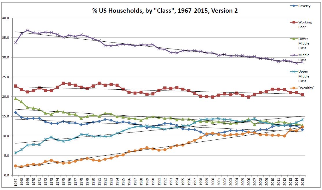
A larger version of the same image
may be viewed here.
Yep – pretty much the same as before. Here, we see that every income category below the upper middle class has gotten proportionally smaller. In contrast, the Upper Middle Class and the “Wealthy” have each grown – hugely.
Conclusions.
The Left’s contention that the US “middle class is shrinking” has a tiny grain of truth – but that grain of truth is wrapped with so much Leftist propaganda and bullsh!t that it obscures reality. The “middle class” is indeed shrinking – EXTREMELY slowly. Statistically speaking, 3.3% of the US population has moved out of the middle class in the last 50 years. At that rate, as noted above it would take the US middle class over 800 years to disappear entirely.
What the left WON’T tell you is the reason why those households have moved out of the middle class. No, those leaving the middle class haven’t become impoverished by those “evil” conservative policies, statistically speaking. Rather, they’ve become enriched instead. Statistically speaking, they left the middle class because they became wealthy.
Why do I say that? I say that because the Low Income category is also shrinking.
In fact, the fraction of Low Income US households is shrinking twice as fast annually, percentage-wise, as the middle class. Where did they go? Again: since the Middle Class is also shrinking, there’s only one place they could have gone. Statistically speaking, they also got wealthy – or at least, wealthier. Today, 6.6% fewer US households are “Low Income” in real terms than was the case in 1967.
The bottom line: in 1967, in real terms 2.4% of US households were “wealthy” in terms of real household income. In 2015, that fraction was 12.3%. Over that roughly 50 year period, nearly 10% of American households left the ranks of the “poor” and “middle class” – and became “wealthy”.
The same is generally true if one looks at the more detailed classes defined in the second “binning” above. There, collectively a net 18.4% – or nearly 1 out every 5.4 American households – moved out of the classes of Poverty, Working Poor, Lower Middle Class, and Middle Class. They moved from there to either the “Upper Middle Class” (real household income between $100,000 and $150,000 annually) or the “Wealthy” (>$200,000) – with the net influx split almost evenly between the latter two categories.
Last time I checked, having a larger household income in real terms was indeed a “good thing”. And becoming “Wealthy” was called “The American Dream”.
In summary: yeah, the US “middle class” is shrinking – at the rate of around 0.067% per year. But the US Low Income “class” is also shrinking – and it’s shrinking at twice the rate. And those two groups are shrinking because members of each are becoming wealthy.
Yes, it’s true that a handful of Americans are filthy rich. There are probably more of those today than in the past.
And that’s also absolutely, positively freaking irrelevant.
Those getting filthy rich are not getting filthy rich because the poor and middle class are “getting screwed”. Rather, while some are becoming filthy rich, many of the poor and middle class are also becoming wealthy right alongside them. In 50 years, nearly 10% of American households have moved from the “low income” and “middle class” categories to the “wealthy” category in real terms.
In short, the Left is misleading or outright lying to us yet again. Is anyone surprised?
Here, for the Left the actual, hard, documented economic data that’s freely available truly is an “inconvenient truth”.
. . .
Data used in this article was obtained from
http://www2.census.gov/programs-surveys/demo/tables/p60/256/table3.xls (Data used is for all races with one of the two entries for 1988 omitted. The dual entries for that year are apparently due to two different methods of calculation used, and using both is impractical. Regardless, they’re pretty damn close to each other, so omitting either makes effectively little or not difference.)
And yes, Poodle – unlike your previous false claim, the data used above IS inflation-adjusted data – AKA “real” income. That’s exactly what the annotation “Income in 2015 CPI-U-RS adjusted dollars” in the description of the data in the original source means. Have someone ‘splain that to you if you don’t “get it”.
Author’s note: I also “ran the numbers” for the 3 income category case – Low Income, Middle Class, and “Wealthy”- with the Middle Class defined as having an upper limit of $200,000 in real household income. This would be necessary to capture many traditional members of the “upper middle class”, such as doctors and dentists who as groups generally have household incomes in excess of $150,000 in real terms.
In that case, the US middle class didn’t shrink appreciably at all between 1967 and today – it actually increased slightly instead. However, the Low Income fraction (real household income of less than $35,000 annually) still shrank by 6.6% – and the fraction of US households classified as “Wealthy” (real household income greater than $200,000 annually) grew by nearly that much (5.1%).
